Basic plotting in ggplot
ggplot is a package that has truly upped the level of producing quality graphics using R. The “g g” in ggplot refers to the grammar of graphics. There has been a lot of development of the theory in what makes a good plot and I encourage you to read more on the subject.
From the ggplot2 website
ggplot2 is a plotting system for R, based on the grammar of graphics, which tries to take the good parts of base and lattice graphics and none of the bad parts. It takes care of many of the fiddly details that make plotting a hassle (like drawing legends) as well as providing a powerful model of graphics that makes it easy to produce complex multi-layered graphics.
The components of a plot are:
- data and aesthetic mappings,
- geometric objects,
- scales,
- facet specification,
- statistical transformations, and
- the coordinate system.
Plots using ggplot() are made in a series of layers. Each layer is composed of:
- data and aesthetic mappings,
- a statistical transformation (stat),
- a geometric object (geom), and
- a position adjustment
There are a TON of options for plots in ggplot and I can not cover them all here. Everything from plotting shapefiles to violin plots. I will provide you the basics, but most are going to require you to look at the website and test out the types of plots you interested in. I strongly encourage you to explore and test out the different types of plots.
To begin and explore ggplot, we will use the diamonds data set.
#install.packages("tidyverse")
library(tidyverse)

data(diamonds)
head(diamonds)
## # A tibble: 6 × 10
## carat cut color clarity depth table price x y z
## <dbl> <ord> <ord> <ord> <dbl> <dbl> <int> <dbl> <dbl> <dbl>
## 1 0.23 Ideal E SI2 61.5 55 326 3.95 3.98 2.43
## 2 0.21 Premium E SI1 59.8 61 326 3.89 3.84 2.31
## 3 0.23 Good E VS1 56.9 65 327 4.05 4.07 2.31
## 4 0.29 Premium I VS2 62.4 58 334 4.20 4.23 2.63
## 5 0.31 Good J SI2 63.3 58 335 4.34 4.35 2.75
## 6 0.24 Very Good J VVS2 62.8 57 336 3.94 3.96 2.48A couple of points to consider and keep in mind:
- Data needs to be in data.frame.
- Layers are separated by
+ - Plots can be saved as objects
There are several ways we can specify data in ggplot. By specifying it in the top of the hierarchy (i.e., in ggplot()), then all the subsequent layers will use this data set. My personal feeling is to specify it in the layers so that it is clear which data you are using. I feel the same way about the aesthetics as well, but sometimes this it is required to put them in the top (i.e., position_dodge() and error bars)
ggplot(data = diamonds,aes(x=carat, y=price)) +
  geom_point()
#or

ggplot() +
  geom_point(data = diamonds,aes(x=carat, y=price))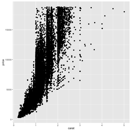
We have lots of options of the aesthetics when we are building the plots. The required aesthetics will depend on the geometry chosen. There are numerous geometries available.
Common aesthetics:
x: the x coordinates of the data that you wish to plot. Can be numeric or categorical.y: the y-coordinates of the data that you wish to plot.colororcolour: the color of points, lines, or edges. Colors can be specified using any of the R colorsfill: similar to color but this specifies the fill of of polygons, bars, or other shapes.size: the size of the points or the thickness of the lineshape: used in geom_point to specify the different pointslinetype: the type of line to be plotted (e.g.,solid,dashed,dotted)alpha: the transparency level of the layer
When we put these on the outside the aesthetic statement aes(), all points are treated the same.
#color
ggplot() +
  geom_point(data = diamonds,aes(x=carat, y=price), colour ="dodgerblue")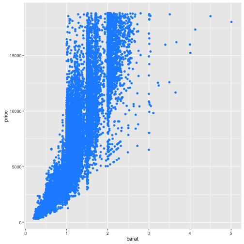
#shape
ggplot() +
  geom_point(data = diamonds,aes(x=carat, y=price), colour ="dodgerblue", shape = 17)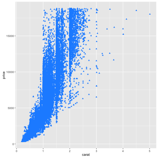
#size
ggplot() +
  geom_point(data = diamonds,aes(x=carat, y=price), colour ="dodgerblue", shape = 17, size =5)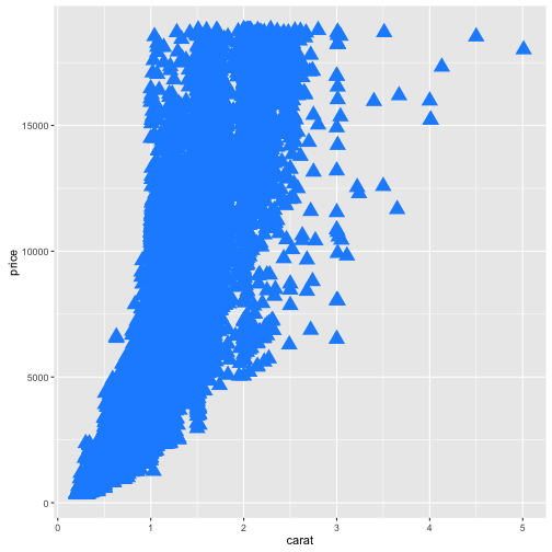
#alpha
ggplot() +
  geom_point(data = diamonds,aes(x=carat, y=price), colour ="dodgerblue", shape = 17, size =5, alpha = 0.25)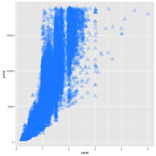
When we put these on the inside the aesthetic statement aes(), points are treated differently based on the level of the variable. These are then given a value in a legend. Numeric values are given a continuous scale and characters or factors are given a discrete scale.
#color
#numeric
ggplot() +
  geom_point(data = diamonds,aes(x=carat, y=price, colour=carat))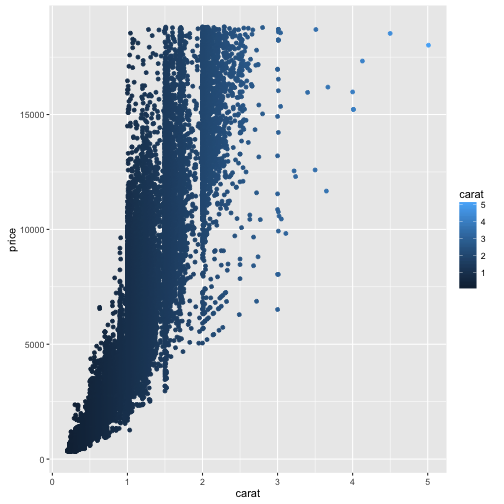
#factor
ggplot() +
  geom_point(data = diamonds,aes(x=carat, y=price, colour=cut))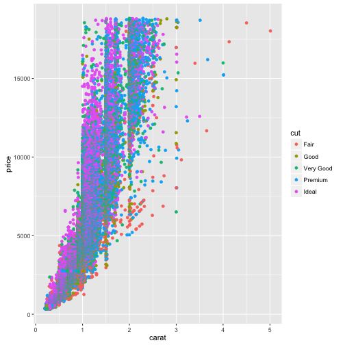
#shape
ggplot() +
  geom_point(data = diamonds,aes(x=carat, y=price, colour=carat, shape = cut))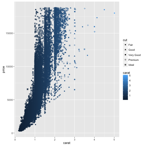
#size
ggplot() +
  geom_point(data = diamonds,aes(x=carat, y=price, colour=carat,size = carat))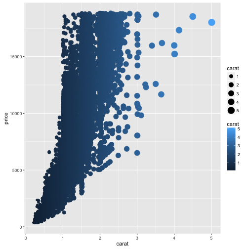
#alpha
ggplot() +
  geom_point(data = diamonds,aes(x=carat, y=price, colour=carat, alpha = carat))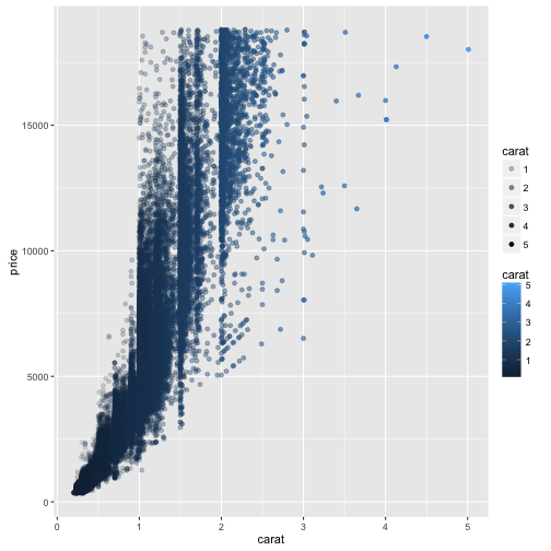
Bar plots
Start by making some data
fake_data = data.frame(Type = rep(c("A","B","C"),  each = 30),
                       Value = c(rnorm(30, mean = 50, sd = 5),
                                 rnorm(30, mean = 70, sd = 3),
                                 rnorm(30, mean = 20, sd = 8)))

fake_data_sum <- fake_data %>%
                  group_by(Type) %>%
                  summarise(M_val = mean(Value),
                            SE_val = sd(Value)/sqrt(length(Value))) %>%
                  mutate(CI_lo = M_val - 1.96 * SE_val,
CI_hi = M_val + 1.96 * SE_val)ggplot() +
geom_bar(data = fake_data_sum, aes(x = Type, y = M_val), stat = "identity") +
theme_bw()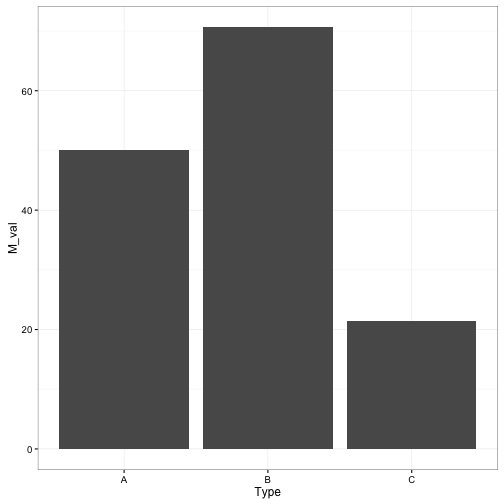
ggplot() +
  geom_bar(data = fake_data_sum, aes(x = Type, y = M_val, fill = Type), stat = "identity") +
  theme_bw()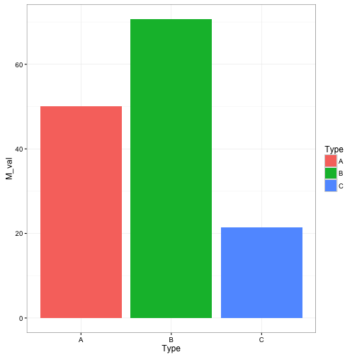
We can control how these values are presented by using the scale commands
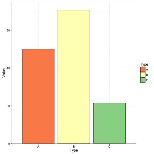
# manual
ggplot() +
  geom_bar(data = fake_data_sum, aes(x = Type, y = M_val, fill = Type), stat = "identity", colour = "black") +
  scale_fill_manual(values = c("A" = "red", "B" = "blue", "C" = "green")) +
  labs(x = "Type", y = "Value") +
  theme_bw()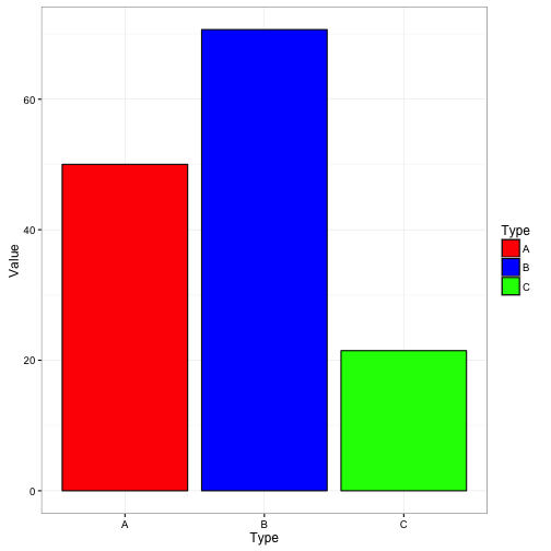
# color brewer [http://colorbrewer2.org/#type=sequential&scheme=BuGn&n=3]
ggplot() +
  geom_bar(data = fake_data_sum, aes(x = Type, y = M_val, fill = Type), stat = "identity", colour = "black") +
  scale_fill_brewer(palette = "Spectral") +
  labs(x = "Type", y = "Value") +
  theme_bw()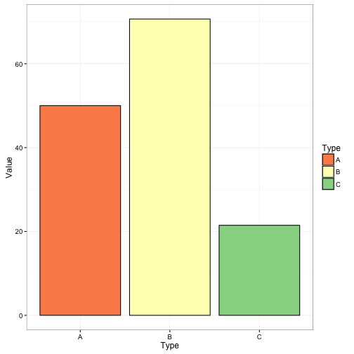
Controlling axes
ggplot() +
  geom_bar(data = fake_data_sum, aes(x = Type, y = M_val, fill = Type), stat = "identity", colour = "black") +
  scale_fill_brewer(palette = "Spectral") +
  scale_y_continuous(limits = c(0, 40)) +
  labs(x = "Type", y = "Value") +
  theme_bw()
## Warning: Removed 2 rows containing missing values (position_stack).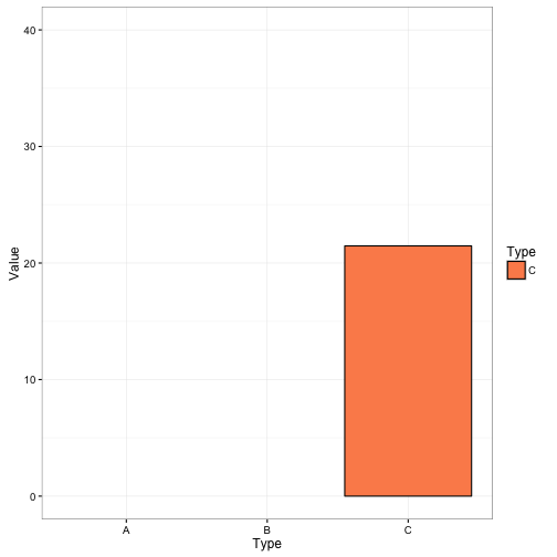
ggplot() +
  geom_bar(data = fake_data_sum, aes(x = Type, y = M_val, fill = Type), stat = "identity", colour = "black") +
  scale_fill_brewer(palette = "Spectral") +
  coord_cartesian(ylim = c(0, 30)) +
  labs(x = "Type", y = "Value") +
  theme_bw()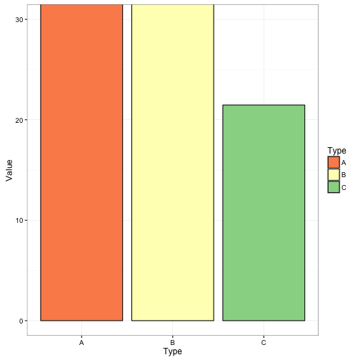
Notice the difference between these plots. scale_y_continuous drops out the bars greater than thelimit set, whereas coord_cartesian keeps the bars but displays limits. Keep that in mind when using these. I tend to always use coord_cartesian and only use scale_y_continuous to set my breaks.
One of the things, that I really dislike about the default ggplot is the pretty spaces that are put into the plots. You can get rid of these using expand = FALSE in coord_cartesian.
ggplot() +
  geom_bar(data = fake_data_sum, aes(x = Type, y = M_val, fill = Type), stat = "identity", colour = "black") +
  scale_fill_brewer(palette = "Spectral") +
  coord_cartesian(ylim = c(0, 75), xlim = c(0.25,3.75), expand = FALSE) +
  labs(x = "Type", y = "Value") +
  theme_bw()