
A few of my favorite themes
The RMarkdown source to this file can be found here
default ggplot themes
One of my favorite aspects of ggplot2 is the use of themes. Not including a theme, the default ggplots theme is the theme_grey which has a dark grey background with white grid lines. See the example below
library(ggplot2)
library(grid)  # Needed for some aspects of the themes
library(scales)  # Needed for some aspects of the themes

ggplot(diamonds, ) + geom_point(aes(x = carat, y = price, colour = cut))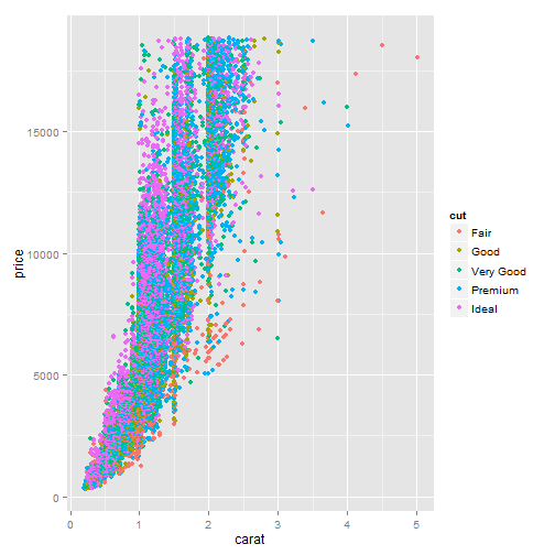
You see these plots all over the place now and you can recognize the ggplot2 style. The problem with the default theme in ggplot is that these do not work for presentation formats (e.g., publication in a journal or presentation).
There are a couple of “canned” themes that come with ggplot that offer themes do change the way the plot looks without having to edit every aspect of the visual presentation of the plot and these are theme_bw() and theme_grey
Here is an example of both plots using each theme side by side (for this presentation I turned “off” the legend).
library(gridExtra)

a <- ggplot(diamonds, ) + geom_point(aes(x = carat, y = price, colour = cut)) +
    labs(title = "theme_grey") + theme(legend.position = "none")

b <- ggplot(diamonds, ) + geom_point(aes(x = carat, y = price, colour = cut)) +
    labs(title = "theme_bw") + theme_bw() + theme(legend.position = "none")

grid.arrange(a, b, nrow = 2)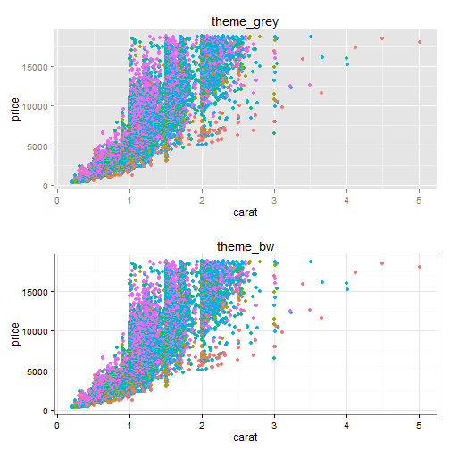
While the theme_bw() is an improvment it still does not meet publication quality figures (atleast in my field) or my typical presentation format. So I generated a few other themese that I use on a regular basis to make inclusion of these figures easier. The basic process is fairly straight forward. You start with the theme_bw and modify using %+replace% the aspects you wish to change.
theme_mine
theme_mine is the theme I use most often and is what I generally use for pubs.
theme_mine <- function(base_size = 12, base_family = "") {
  # Starts with theme_grey and then modify some parts
  theme_bw(base_size = base_size, base_family = base_family) %+replace%
    theme(
      strip.background = element_blank(),
      strip.text.x = element_text(size = 18),
      strip.text.y = element_text(size = 18),
      axis.text.x = element_text(size=14),
      axis.text.y = element_text(size=14,hjust=1),
      axis.ticks =  element_line(colour = "black"),
      axis.title.x= element_text(size=16),
      axis.title.y= element_text(size=16,angle=90),
      #legend.position = "none",
      panel.background = element_blank(),
      panel.border =element_blank(),
      panel.grid.major = element_blank(),
      panel.grid.minor = element_blank(),
      panel.margin = unit(1.0, "lines"),
      plot.background = element_blank(),
      plot.margin = unit(c(0.5,  0.5, 0.5, 0.5), "lines"),
      axis.line = element_line(colour = "black")
    )
}


ggplot(diamonds, ) +
  geom_point(aes(x=carat, y = price,colour=cut)) +
  labs(title="theme_mine") +
  theme_mine()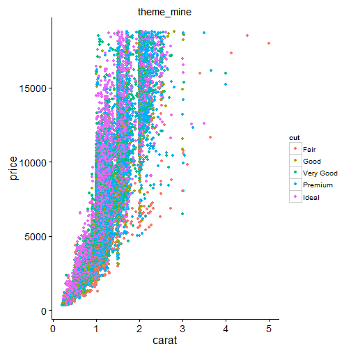
theme_presentation
My general format in presentations is to have a black background with white, yellow, and green text. I therefore created a theme (theme_presentation)that would work with the required black background and white text.
theme_presentation<- function(base_size = 28, base_family = "") {
  # Starts with theme_grey and then modify some parts
  theme_bw(base_size = base_size, base_family = base_family) %+replace%
    theme(
      strip.background = element_blank(),
      strip.text.x = element_text(size = 18,colour="white"),
      strip.text.y = element_text(size = 18,colour="white"),
      axis.text.x = element_text(size=28,colour="white"),
      axis.text.y = element_text(size=28,colour="white",hjust=1),
      axis.ticks =  element_line(colour = "white"),
      axis.title.x= element_text(size=42,colour="white"),
      axis.title.y= element_text(size=42,angle=90,colour="white"),
      #legend.position = "none",
      panel.background = element_rect(fill="black"),
      panel.border =element_blank(),
      panel.grid.major = element_blank(),
      panel.grid.minor = element_blank(),
      panel.margin = unit(1.0, "lines"),
      plot.background = element_rect(fill="black"),
      plot.title =element_text(size=28,colour="white"),
      plot.margin = unit(c(1,  1, 1, 1), "lines"),
      axis.line = element_line(colour = "white"),
      legend.background=element_rect(fill='black'),
      legend.title=element_text(size=28,colour="white"),
      legend.text=element_text(size=28,colour="white"),
      legend.key = element_rect( fill = 'black'),
      legend.key.size = unit(c(1, 1), "lines")
    )
}


ggplot(diamonds, ) +
  geom_point(aes(x=carat, y = price,colour=cut)) +
  labs(title="theme_presentation") +
  theme_presentation() +
  theme(legend.position=c(1,0.25))
## Warning: an argument will be fractionally recycled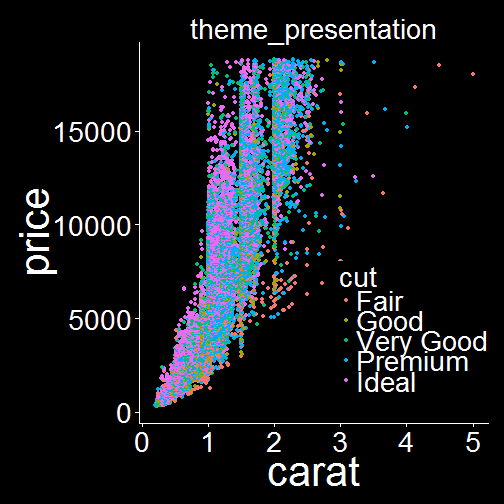
theme_map
I do a lot of map creation using ggplot and therefore the canned themes and the previous themes I discussed do not really fit. So I created a theme (theme_map).
library(maps)
library(reshape2)

theme_map <- function(base_size = 12, base_family = "") {
    # Starts with theme_grey and then modify some parts
    theme_bw(base_size = base_size, base_family = base_family) %+replace% theme(strip.background = element_blank(),
        strip.text.x = element_text(size = 18), strip.text.y = element_text(size = 18),
        axis.text.x = element_blank(), axis.text.y = element_blank(), axis.ticks = element_blank(),
        axis.title.x = element_blank(), axis.title.y = element_blank(), panel.background = element_blank(),
        panel.border = element_blank(), panel.grid.major = element_blank(),
        panel.grid.minor = element_blank(), panel.margin = unit(1, "lines"),
        plot.background = element_blank(), plot.margin = unit(c(0.25, 0.5, 0,
            0), "lines"), axis.line = element_blank(), legend.background = element_blank(),
        legend.margin = unit(0.1, "line"), legend.title = element_text(size = 16,
            colour = "black"), legend.text = element_text(size = 16, colour = "black",
            hjust = 0.2), legend.key = element_blank(), legend.key.width = unit(2,
            "line"), legend.key.height = unit(2, "line"))

}

crimes <- data.frame(state = tolower(rownames(USArrests)), USArrests)
states_map <- map_data("state")

d <- ggplot(crimes, aes(map_id = state)) + geom_map(aes(fill = Murder), map = states_map) +
    labs(title = "default") + expand_limits(x = states_map$long, y = states_map$lat) +
    coord_map()
e <- ggplot(crimes, aes(map_id = state)) + geom_map(aes(fill = Murder), map = states_map) +
    labs(title = "theme_map") + expand_limits(x = states_map$long, y = states_map$lat) +
    coord_map() + theme_map()

grid.arrange(d, e, ncol = 1)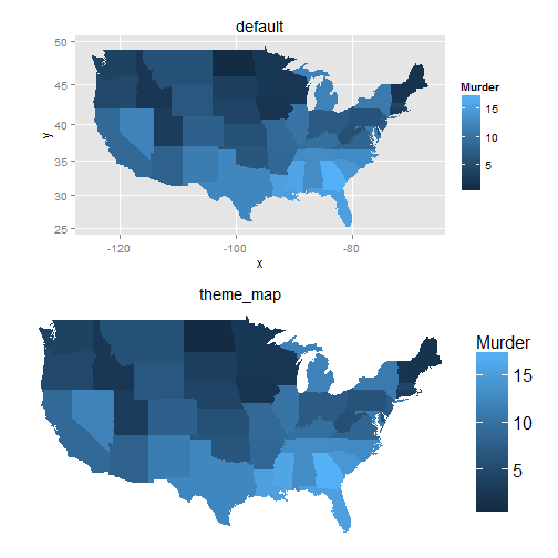
These files are included in a single file I call themes.r which I load as a source file in the housekeeping section of my R code. I included this file here, which includes a theme_transparent and a theme_map_presentation that were not discussed above but ones that I use every once in a while. If anyone has another theme or theme ideas I would love to hear about them.
Leave a Comment