
Using geom_blank for better axis ranges in ggplot
The RMarkdown source to this file can be found here
Using facet_wrap() in ggplot2 is a great way to create multiple panelled plots. Though when I am running these, particularly on datasets with different scales, the axis are not as clean as I like. To provide an illustration of what I am referring to, I will make up some fake data with some different scales in the y values and then plot these in ggplot
Plot as is
set.seed(20140824)

library(ggplot2)
## Use suppressPackageStartupMessages to eliminate package startup messages.# First make up some data with different values for y with different scales
foo.dat<-rbind(data.frame(group="A", x = runif(50), y=rnorm(50,mean=5)),
data.frame(group="B", x = runif(50), y=rnorm(50,mean=5,sd=3)+20),
data.frame(group="C", x = runif(50), y=rnorm(50,mean=5,sd=5)+30))
## Plot it in ggplot
ggplot() +
geom_point(data=foo.dat,aes(x=x,y=y,colour=group),size=4) +
facet_wrap(~group,scales="free_y") + ## using scales="free_y" allows the y-axis to vary while keeping x-axis constant among plots
theme_bw()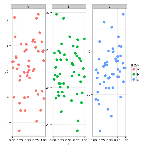
coord_cartesian
When using a single panel or data that is all on the same scale, I frequently use coord_cartesian. Unfortunately when you have panels with different scales this is no longer as useful because it forces everything on the same scale (which depending on what you are looking at may not be bad).
ggplot() + geom_point(data = foo.dat, aes(x = x, y = y, colour = group), size = 4) +
    facet_wrap(~group, scales = "free_y") + coord_cartesian(ylim = c(0, 50)) +
    theme_bw()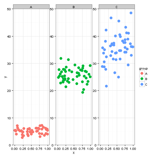
expand_limits and scale_y_continuous
Another option is to use expand_limits() to force each panel to start at the origin and then use scale_y_continuous(expand=c(0,0)) to remove any extra space on around the y-axis limits. The two values in expand are c(multiplier buffer, additive buffer). By including a c(0,0) we are not including any buffer on the axis scale.
## Plot it in ggplot
ggplot() + geom_point(data = foo.dat, aes(x = x, y = y, colour = group), size = 4) +
    facet_wrap(~group, scales = "free_y") + expand_limits(y = 0) + scale_y_continuous(expand = c(0,
    0)) + theme_bw()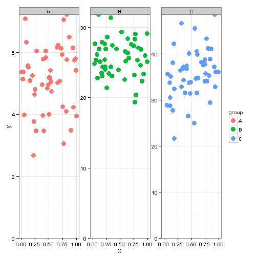
As you can see in the above plot, using the combo of expand_limits and scale_y_continuous(expand=c(0,0) we can force the minimum to start at 0 but it max values are not as clean as I would like. This is where geom_blank() comes in. The purpose, according to the help files for geom_blank() are to essentially draw nothing. When I first saw this, I was really baffled. Why would you not want something that drew nothing? I then realized the benefit of this in axis formatting.
geom_blank
The first thing to do, is to create a dataset with the mins and maxes of the y axis for each group level in our dataset. This is then passed to ggplot using geom_blank
blank_data <- data.frame(group = c("A", "A", "B", "B", "C", "C"), x = 0, y = c(0,
    8, 0, 40, 0, 50))

## Plot it in ggplot
ggplot() + geom_point(data = foo.dat, aes(x = x, y = y, colour = group), size = 4) +
    geom_blank(data = blank_data, aes(x = x, y = y)) + facet_wrap(~group, scales = "free_y") +
    expand_limits(y = 0) + scale_y_continuous(expand = c(0, 0)) + theme_bw()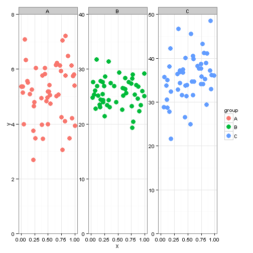
So we now have a plot with much cleaner y-axis ranges and plots that we can now present in public.
Leave a Comment