The RMarkdown file for this lesson can be found here.
This lesson will follow Chapter 2 in Quinn and Keough (2002).
Samples and populations
Biologists want to make inferences about a population based on subsamples of that population.
- collections of the population are the sample
- number of observations is the sample size
Basic method of sampling is simple random sampling (all observations have the same probability of being sampled)
- rarely does this happen (Why is this a concern?)
Random sampling is important because we want to use sample statistics to estimate the population parameters. We can not directly measure the population parameters because it is too large.
A good estimator of a population should:
- be unbiased. Repeated samples should produce estimates that do not under or over estimate the population parameter
- consistent so with increases in sample size should bring the sample parameter closer to the population parameter.
- should be efficient (has the lowest variance among competing estimates)
There are two broad types of estimators:
- point estimates (single value)
- interval estimates (range of values)
Common parameters and statistics
Center (location of distribution)
To explore these statistics, we will generate a large sample of data.
set.seed(9222016)

rand_data <- data.frame(obs = 1:999,concentration = rnorm(999, 113, 16))
head(rand_data)
## obs concentration
## 1 1 133.8229
## 2 2 121.6124
## 3 3 108.5641
## 4 4 126.4179
## 5 5 138.6853
## 6 6 142.1567# minumum
min(rand_data$concentration)## [1] 53.44413# maximum
max(rand_data$concentration)## [1] 157.0837Lets visualize this using a histogram. There are two approaches we can do this. One is to generate the binned data with dplyr and the other is to use geom_histogram in ggplot.
library(ggplot2)
library(dplyr)
##
## Attaching package: 'dplyr'## The following objects are masked from 'package:stats':
##
## filter, lag## The following objects are masked from 'package:base':
##
## intersect, setdiff, setequal, union# We can set the number of bins to add the data
ggplot(data = rand_data) +
geom_histogram(aes(x = concentration), fill = "dodgerblue", colour="black", bins = 50) +
theme_bw()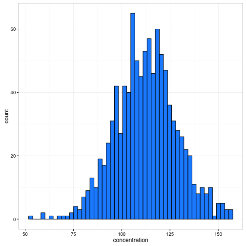
# or we can set how wide we want the binds to be
ggplot(data = rand_data) +
  geom_histogram(aes(x = concentration), fill = "dodgerblue", colour="black", binwidth = 5) +
  theme_bw()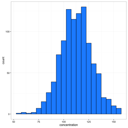
# use dplyr to create bins and then geom_bar to create plot

summ_data<-rand_data %>%
            mutate(bin = cut(rand_data$concentration, seq(50,175, by = 5), labels =seq(50,170, by = 5))) %>%
            group_by(bin) %>%
            summarise(N = n()) %>%
            ungroup() %>%
            mutate(bin = as.numeric(as.character(bin)))

ggplot(data = summ_data) +
  geom_bar(aes(x = bin, y = N), stat ="identity",fill = "dodgerblue", colour = "black", width = 5) +
  theme_bw()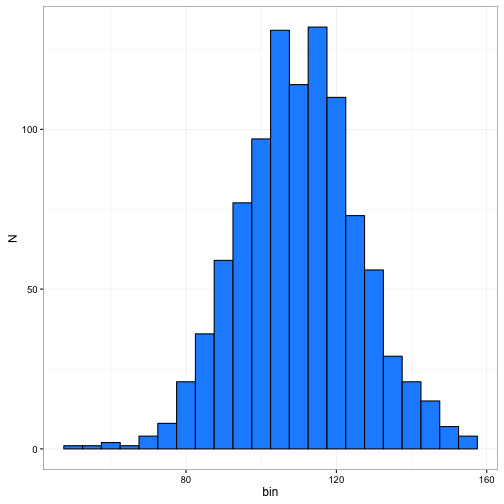
L-estimator
L-estimator is based on ordering data from smalles to largest then using a linear combination of weighted-order statitistics
Mean
The mean is an unbiased estimator of population mean where each observation is weighted by 1/n.
sum(rand_data$concentration) / length(rand_data$concentration)## [1] 112.6013mean(rand_data$concentration)## [1] 112.6013Median
Median is an unbiased estimator of population mean for normal distribution, better estimator in skewed distributions
# First order the data from smallest to largest
conc_ordered <- rand_data$concentration[order(rand_data$concentration)]

length(conc_ordered)  # find number of values
## [1] 999conc_ordered[500] # 500 is the midpoint of 999## [1] 112.683median(rand_data$concentration)## [1] 112.683Trimmed mean
Trimmed mean is the mean after trimming off a proportion of the data from the highest and lowest observations. Can help deal with outliers.
concentration = c(2,4,6,7,11,21,81,90,105,121)

# First order the data from smallest to largest
conc_ordered <- concentration[order(concentration)]

length(conc_ordered) *0.10  # need to remove the smallest and largest 50 values
## [1] 1conc_ordered[-c(1,10)] # remove those values## [1] 4 6 7 11 21 81 90 105mean(conc_ordered[-c(1,10)])## [1] 40.625mean(conc_ordered, trim = 0.1) # you can use the trim function in mean()## [1] 40.625Winsorized mean
Winsorized mean is similar to the trimmed mean but the values that are excluded are replaced by the neighboring value (substituted rather than dropped).
# First order the data from smallest to largest
conc_ordered <- concentration[order(concentration)]

length(conc_ordered) *0.10  # need to remove the smallest and largest 50 values
## [1] 1conc_ordered[-c(1,10)] # remove those values## [1] 4 6 7 11 21 81 90 105mean(conc_ordered[c(2,2,3,4,5,6,7,8,9,9)])## [1] 43.4install.packages('psych')library(psych)##
## Attaching package: 'psych'## The following objects are masked from 'package:ggplot2':
##
## %+%, alphawinsor.mean(concentration, trim = 0.1) ## [1] 43.54Notice that these numbers are slightly different. That is because instead of replacing the trimmed values with the nearest number, winsor.mean replaces them with the 20% and 80% quantile.
M-estimators
M-estimators give different weights gradually from the middle of the sample and incorporate a measure of variability in the estimation procedure. Uses an iterative approach and are useful with extreme outliers.
Not commonly used but do have a role in robust regression and ANOVA techniques for analyzing linear models.
library(MASS) #requires the MASS package##
## Attaching package: 'MASS'## The following object is masked from 'package:dplyr':
##
## selectdata(chem) #load the chem dataset
chem_data<-data.frame(ind = 1:length(chem),chem = chem)
ggplot(data = chem_data) +
geom_point(aes(x = ind, y= chem), size = 2, colour = "firebrick") +
theme_bw()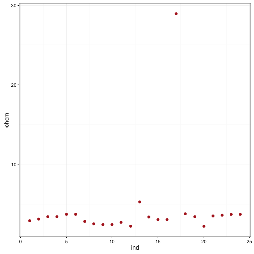
We can see from this data that there is one HUGE outlier. Running huber and mean give us different results.
mean(chem)## [1] 4.280417huber(chem)## $mu
## [1] 3.206724
##
## $s
## [1] 0.526323R-estimators
R-estimators based on the ranks of the observations rather than the observations themselves and form the basis for many rank- based “non-parametric” tests.
Hodges–Lehmann estimator
Hodges–Lehmann estimator is the median of the averages of all possible pairs of observations
fake_data<- rpois(20, 10)

#all possible combinations
all_combos <- expand.grid(x=(fake_data), y = (fake_data))

all_combos$mean <- apply(all_combos,1,mean)

median(all_combos$mean)
## [1] 9.5# We can get the same answer from the wilcox test
wilcox.test(fake_data, conf.int = TRUE)$estimate## Warning in wilcox.test.default(fake_data, conf.int = TRUE): cannot compute
## exact p-value with ties## Warning in wilcox.test.default(fake_data, conf.int = TRUE): cannot compute
## exact confidence interval with ties## (pseudo)median
## 9.499999Spread or variability of your sample
Like estimators for the central tendency of your data, there are also numerous ways to assess the spread in your sample.
Going back to our concentration data that we created earlier, we will look at some of these estimates.
Range
The range is perhaps the simplest estimate of the spread of your data
# range
range(rand_data$concentration) #minimum and maximum
## [1] 53.44413 157.08372Variance
Variance is the average squared deviation from the mean.
sum_squares<-sum((rand_data$concentration - mean(rand_data$concentration))^2)
sum_squares / (length(rand_data$concentration) - 1) # variance
## [1] 250.8505var(rand_data$concentration)## [1] 250.8505Standard deviation
Square root of the variance.
sqrt(var(rand_data$concentration))## [1] 15.83826sd(rand_data$concentration)## [1] 15.83826Coefficient of variation
Used to compare standard deviations across populations with different means because it is independent of the measurement units.
sd(rand_data$concentration) / mean(rand_data$concentration)## [1] 0.1406579Median absolute deviation
Less sensitive to outliers than the above measures and is presented in association with medians.
abs_deviation <-abs(rand_data$concentration - median(rand_data$concentration))
median(abs_deviation) * 1.4826
## [1] 15.21385mad(rand_data$concentration)## [1] 15.21385Interquartile range
The difference between the first quartile and the third quartile. Used in ggplots geom_boxplot.
quantz <- quantile(rand_data$concentration, c(0.75, 0.25))
quantz[1] - quantz[2]
## 75%
## 20.36174IQR(rand_data$concentration)## [1] 20.36174Degrees of freedom
Degrees of freedom is simply the number of observations in our sample that are “free to vary” when we are estimating the variance. We already know one of those values is the mean, thus df = n - 1.
Standard error
The standard error of the mean is describing the variation in our sample mean. It is termed an error because it is the error about $\bar{y}$. If the error is large, then repeated sampling would produce different means.
Standard error is calculated as the standard deviation divided by the square root of the number of observations. There is no function in stats that calculates the standard error.
se <- sd(rand_data$concentration)/sqrt(length(rand_data$concentration))

se
## [1] 0.5011004Confidence intervals
NOTE: all of this is assuming normality. If you are not working with a normal distribution then other methods maybe necessary to calculate variance (in particular).
In frequentist terms, the confidence interval is not a probability statement. A confidince interval can be thought of, in this context, as one interval generated by a procedure that will give correct intervals 95% of the time.
Confidence intervals can be calculated using the t-statistic critical value and the standard error. The width of the confidence interval can be found using the qt() function in R.
critical.vals<-data.frame(ConfidenceInterval=c('99%','95%','90%','80%'),
                          CriticalValue=c(abs(qt(0.010, 10000)),
                                         abs(qt(0.025,10000)),
                                         abs(qt(0.050, 10000)),
                                         abs(qt(0.10, 10000))))

critical.vals
## ConfidenceInterval CriticalValue
## 1 99% 2.326721
## 2 95% 1.960201
## 3 90% 1.645006
## 4 80% 1.281636We can illustrate this using ggplot2.
set.seed(12345)

x<-data.frame(obs=1:100,val=rnorm(100))
head(x)
## obs val
## 1 1 0.5855288
## 2 2 0.7094660
## 3 3 -0.1093033
## 4 4 -0.4534972
## 5 5 0.6058875
## 6 6 -1.8179560se_conc <- sd(x$val)/sqrt(length(x$val))
sd_conc <- sd(x$val)
mean_conc<- mean(x$val)
ggplot(data = x) +
geom_histogram(aes(x = val),fill = "dodgerblue", colour = "black") +
geom_errorbarh(aes(xmin = mean_conc - 1.96*se_conc, xmax = mean_conc + 1.96*se_conc, y = 15, x =mean_conc )) +
geom_point(aes(x = mean_conc, y = 15), size = 1) +
geom_errorbarh(aes(xmin = mean_conc - 1.96*sd_conc, xmax = mean_conc + 1.96*sd_conc, y = 13, x =mean_conc ),colour="red") +
geom_point(aes(x = mean_conc, y = 13), size = 1,colour="red") +
annotate("text", x = c(0.75,2.7), y = c(15,13), label = c("se", "sd")) +
theme_bw()## `stat_bin()` using `bins = 30`. Pick better value with `binwidth`.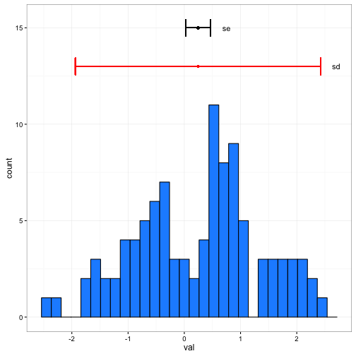
You can see the difference in the above plot. Standard deviations describe the spread in the data, whereas the standard error describes where the mean (or predicted value) falls.
What happens to the standard error as we increase the sample size to 200, 500, 1000?
Resampling methods
There are a couple of different ways to calculate the spread or confidence interval when the sampling distribution is unknown or is definitively not normal. These methods involve resampling your data over many different iterations to build distributions of the expected values (i.e., means, medians, confidence intervals).
Jackknifing
Jackknifining is a predecessor of bootstrapping and is less computationally expensive. Jackknifing is done by going through the data and leaving one observation out and calulating the sample statistic of interest. The term ‘jackknifing’ was coined by John Tukey referring to its robustness as a tool.
We can explore this below:
rand_values <- data.frame(x = 1:75,val =rnorm(75, mean = 10, sd = 3))  # Generate random values

head(rand_values)
## x val
## 1 1 10.671776
## 2 2 6.531330
## 3 3 11.267256
## 4 4 6.025734
## 5 5 10.423253
## 6 6 8.391856stor_vals<-data.frame(iter = 1:nrow(rand_values), j_mean=NA) # create a data.frame to store values
head(stor_vals)## iter j_mean
## 1 1 NA
## 2 2 NA
## 3 3 NA
## 4 4 NA
## 5 5 NA
## 6 6 NA# to do this we will need to run a loop
for(i in 1:nrow(rand_values)){
sub_rand_values<-rand_values[-i,] # remove that data value
mean_val <- mean(sub_rand_values$val)
stor_vals$j_mean[i] <- mean_val # store that mean for the iteration
}
ggplot(data = stor_vals) +
geom_histogram(aes(x = j_mean), bins = 30) +
geom_vline(aes(xintercept = mean(rand_values$val)), colour = "red") +
geom_vline(aes(xintercept = mean(stor_vals$j_mean)), colour = "blue", linetype = "dashed") +
theme_bw()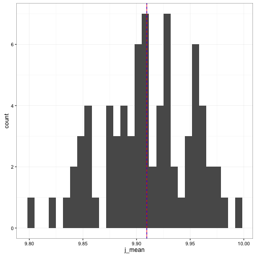
Bootstrapping
Bootstrapping is another resampling technique. Instead of “leaving one out”, we resample the data. We have two options. One is to take a random subset of the data (likely with no replacement) or resample the full number of the data set (with replacement). Like the jackknife, we calculate our sample statistic. Unlike the jackknife, it tends to be a general rule that we resample a lot of times. The general rule is ~ 1,000 times.
head(rand_values)## x val
## 1 1 10.671776
## 2 2 6.531330
## 3 3 11.267256
## 4 4 6.025734
## 5 5 10.423253
## 6 6 8.391856iter = 1000 # number of iterations
stor_vals_bs<-data.frame(iter = 1:iter, bs_mean=NA) # create a data.frame to store values
head(stor_vals_bs)## iter bs_mean
## 1 1 NA
## 2 2 NA
## 3 3 NA
## 4 4 NA
## 5 5 NA
## 6 6 NA# to do this we will need to run a loop
for(i in 1:iter){
sub_rand_values<-rand_values[sample(1:nrow(rand_values),nrow(rand_values),replace = TRUE),] # remove that data value
mean_val <- mean(sub_rand_values$val)
stor_vals_bs$bs_mean[i] <- mean_val # store that mean for the iteration
}
ggplot(data = stor_vals_bs) +
geom_histogram(aes(x = bs_mean), bins = 30) +
geom_vline(aes(xintercept = mean(rand_values$val)), colour = "red") +
geom_vline(aes(xintercept = mean(stor_vals_bs$bs_mean)), colour = "blue", linetype = "dashed") +
theme_bw()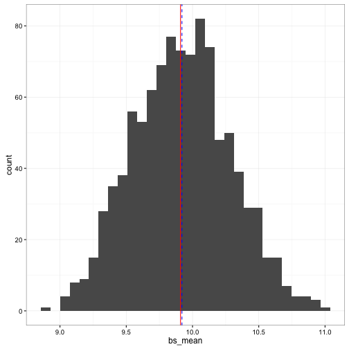
Now it is your turn
- Load the
lovettdata from our github website (data/ExperimentalDesignData/chpt2/) using the appropriate means - Calculate these statistics for SO4, SO4MOD, and CL
- Mean
- Median
- 5% trimmed mean
- Huber’s M-estimate
- Standard deviation
- Interquartile range
- Median absolute deviation
- Standard error of mean
- 95% confidence interval for mean
- Combine these in a single data.frame
Use the bootstrapping approach to calculate for SO4:
- Mean
- Standard error
- 95% confidence interval
- Median
- Standard error
- Combine these in a data.frame with the values from the population