The RMarkdown file for this lesson can be found here
This lesson will follow Chapter 5 in Quinn and Keough (2002).
Correlation analysis
Consider a study, where we are interested in the relationship between two random variables.
library(tidyverse)## Loading tidyverse: tibble
## Loading tidyverse: tidyr
## Loading tidyverse: readr
## Loading tidyverse: purrr## Conflicts with tidy packages ----------------------------------------------## %+%(): ggplot2, psych
## alpha(): ggplot2, psych
## combine(): dplyr, gridExtra
## filter(): dplyr, stats
## lag(): dplyr, stats
## select(): dplyr, MASSlibrary(gridExtra)
library(RCurl)## Loading required package: bitops##
## Attaching package: 'RCurl'## The following object is masked from 'package:tidyr':
##
## completelibrary(MASS)Bivariate normal distribution
We need to think of our data as a population of \( y_{i1} \) and \(y_{i2} \) pairs (a joint distribution of two variables or a bivariate distribution).
The bivariate normal distribution is defined by the mean and standard deviation of each variable and a parameter called the correlation coefficient, which measures the strength of the relationship between the two variables. A bivariate normal distribution implies that the individual variables are also normally distributed and also implies that any relationship between the two variables is a linear one.
set.seed(12345)

    mean.x = 70  # mean of variable 1
    sd.x=3  # sd of variable 1
    mean.y=162 # mean of variable 2
    sd.y=14 # sd of variable 1
    r=0.55 # correlation between the two
    z1 <- rnorm(100)
    z2 <- rnorm(100)
    x1 <- sqrt(1-r^2)*sd.x*z1 + r*sd.x*z2 + mean.x
    y1 <- sd.y*z2 + mean.y

    r=0.90 # correlation between the two
    x2 <- sqrt(1-r^2)*sd.x*z1 + r*sd.x*z2 + mean.x
    y2 <- sd.y*z2 + mean.y

data_for_plot<- rbind(data.frame(x = x1, y = y1, r =0.55),
                       data.frame(x = x2, y = y2, r = 0.90))
data_for_plot %>%
gather(var, val, x:y) %>%
ggplot() +
geom_density(aes(x=val, fill = var), alpha = 0.55) +
facet_wrap(~r, ncol = 1,labeller = label_both) +
theme_bw()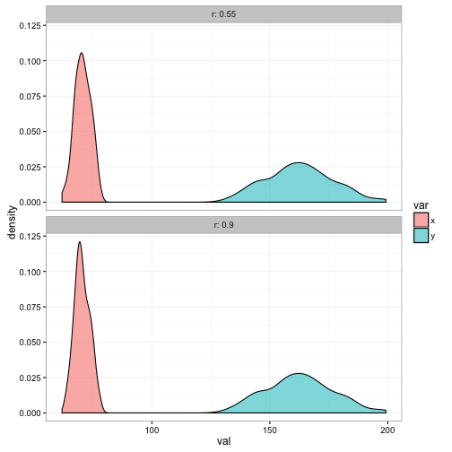
ggplot(data=data_for_plot) +
  geom_point(aes(x = x, y = y), color = "red", size =1) +
  facet_wrap(~r, ncol = 1,labeller = label_both) +
  theme_bw()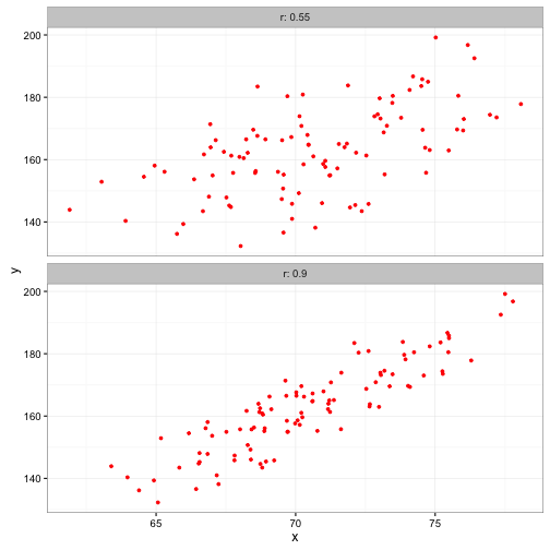
Covariance and correlation
Covariance is the linear relationship between two continuous variables.
Covariance
and goes from \( -\infty \) to \( +\infty \)
#Covariance
dev.x<- x1 - mean(x1)
dev.y<- y1 - mean(y1)

sum(dev.x * dev.y)/ (length(dev.x) - 1)
## [1] 27.74278cov(x1,y1)## [1] 27.74278One problem with covariance is that the absolute magnitude depends on the units of the two variables
cov(x1,y1)## [1] 27.74278cov(x1*1000,y1*100)## [1] 2774278Pearson correlation
The covariance can be standardized by dividing by the standard deviations of the two variables so that the value range between -1 and +1. This is called the Pearson (product-moment) correlation.
The Pearson correlation measures the “strength” of the linear relationship between the two continuous variables.
sum(dev.x * dev.y)/ (sqrt(sum(dev.x^2) * sum(dev.y^2))) ## [1] 0.5764552cor(x1,y1, method = "pearson")## [1] 0.5764552cor.test(x1,y1, method = "pearson")##
## Pearson's product-moment correlation
##
## data: x1 and y1
## t = 6.9837, df = 98, p-value = 3.472e-10
## alternative hypothesis: true correlation is not equal to 0
## 95 percent confidence interval:
## 0.4285615 0.6942644
## sample estimates:
## cor
## 0.5764552Remember up above when we generated x1 and y1 that we used a correlation value, r, of 0.55.
Robust correlation (Spearman’s rank correlation)
We may have a situation where the joint distribution of our two variables is not bivariate normal.
- non-normality in either variable
- monotonic relationships that are not linear
r_x1<-rank(x1)
r_y1<-rank(y1)

cor(r_x1, r_y1)
## [1] 0.5744134cor(x1, y1, method ="spearman")## [1] 0.5744134# Kendalls tau is based on concordant and disconcordant pairs. is more conservative than spearman
cor(x1, y1, method ="kendall")## [1] 0.3967677Parametric and non-parametric confidence regions
When representing a bivariate relationship with a scatterplot, it is often useful to include confidence regions. The confidence region is the region within which we would expect the observation represented by the population mean of the two variables to occur a percent of the time under repeated sampling from this population.
crabs<-read_csv(getURL("https://raw.githubusercontent.com/chrischizinski/SNR_R_Group/master/data/ExperimentalDesignData/chpt5/green.csv"))

crabs$SITE<-factor(crabs$SITE, levels = c("LS","DS"))

ggplot(data = crabs) +
  geom_point(aes(x = TOTMASS, y = BURROWS), size = 2) +
  facet_wrap(~SITE, ncol = 2) +
  coord_cartesian(xlim = c(0,8), ylim = c(0, 120), expand = F) +
  scale_x_continuous(breaks = seq(0,8, by=2)) +
  labs(x = "Total crab biomass", y = "Number of burrows") +
  theme_bw()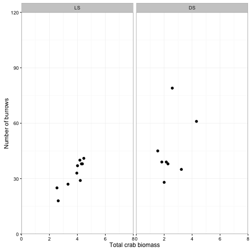
Confidence ellipse
Assuming our two variables follow a bivariate normal distribution, the confidence band will always be an ellipse centered on the sample means of \( y_{i1} \) and \(y_{i2} \) and the orientation of the ellipse is determined by the covariance or correlation.
p<-ggplot(data = crabs) +
  geom_point(aes(x = TOTMASS, y = BURROWS), size = 2) +
  stat_ellipse(geom = "polygon", aes(x = TOTMASS, y = BURROWS), type = "norm", level = 0.95, fill = "pink", alpha = 0.25, color = "black") +
  facet_wrap(~SITE, ncol = 2) +
  coord_cartesian(xlim = c(0,8), ylim = c(0, 120), expand = F) +
  scale_x_continuous(breaks = seq(0,8, by=2)) +
  labs(x = "Total crab biomass", y = "Number of burrows") +
  theme_bw()

p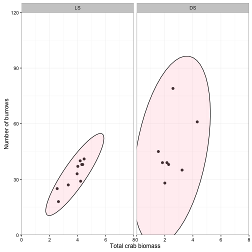
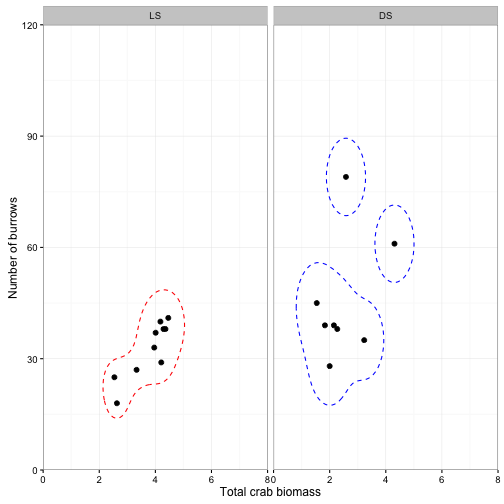
Kernel density
Sometimes we are not interested in the population mean of \( y_{i1} \) and \(y_{i2} \) but we just want a confidence interval based on the observed data. The kernel density for a value of *y
- is the sum of hte estimates from a series of symmetrical distributuoins fitted to groups of local observations. Note that they are not constrained to an elliptical shape.
## For site LS
dens1 <- kde2d(crabs$TOTMASS[crabs$SITE =="LS"], crabs$BURROWS[crabs$SITE =="LS"], n = 100, lims = c(0,8,0,120))

densdf <- data.frame(expand.grid(TOTMASS = dens1$x, BURROWS =dens1$y), z = as.vector(dens1$z), SITE = "LS")

densdf$SITE<-factor(densdf$SITE, levels = c("LS","DS"))

getLevel <- function(x,y,prob=0.95) {
    kk <- MASS::kde2d(x,y)
    dx <- diff(kk$x[1:2])
    dy <- diff(kk$y[1:2])
    sz <- sort(kk$z)
    c1 <- cumsum(sz) * dx * dy
    approx(c1, sz, xout = 1 - prob)$y
}
L95 <- getLevel(crabs$TOTMASS[crabs$SITE=="LS"],crabs$BURROWS[crabs$SITE=="LS"])

## For site DS
dens2 <- kde2d(crabs$TOTMASS[crabs$SITE =="DS"], crabs$BURROWS[crabs$SITE =="DS"], n = 100, lims = c(0,8,0,120))

densdf2 <- data.frame(expand.grid(TOTMASS = dens2$x, BURROWS =dens2$y), z = as.vector(dens2$z), SITE = "DS")
densdf2$SITE<-factor(densdf2$SITE, levels = c("LS","DS"))
L952 <- getLevel(crabs$TOTMASS[crabs$SITE=="DS"],crabs$BURROWS[crabs$SITE=="DS"])


ggplot(data = crabs) +
  geom_point(aes(x = TOTMASS, y = BURROWS), size = 2) +
  geom_contour(data=densdf,aes(x = TOTMASS, y = BURROWS,z=z), breaks=L95, color="red", linetype = "dashed") +
    geom_contour(data=densdf2,aes(x = TOTMASS, y = BURROWS,z=z), breaks=L952, color="blue", linetype = "dashed") +
  facet_wrap(~SITE, ncol = 2) +
  coord_cartesian(xlim = c(0,8), ylim = c(0, 120), expand = F) +
  scale_x_continuous(breaks = seq(0,8, by=2)) +
  labs(x = "Total crab biomass", y = "Number of burrows") +
  theme_bw()